See My Design Projects
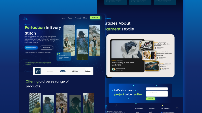
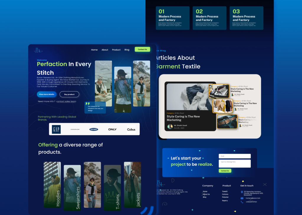
Showcasing Bunon Texwear Ltd. with a Modern Website
There are many variations of passages of Lorem Ipsum available, but the majority have suffered alteration in some form, by injected humour, or randomised words which don’t look even slightly believable. If you are going to use a passage of Lorem Ipsum. You need to be sure there isn’t anything embarrassing hidden in the middle of text. All the Lorem Ipsum generators on the Internet tend toitrrepeat predefined chunks.
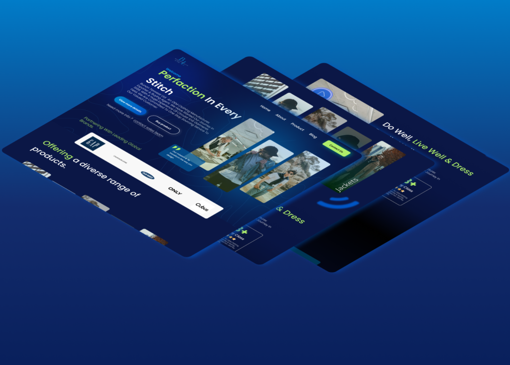
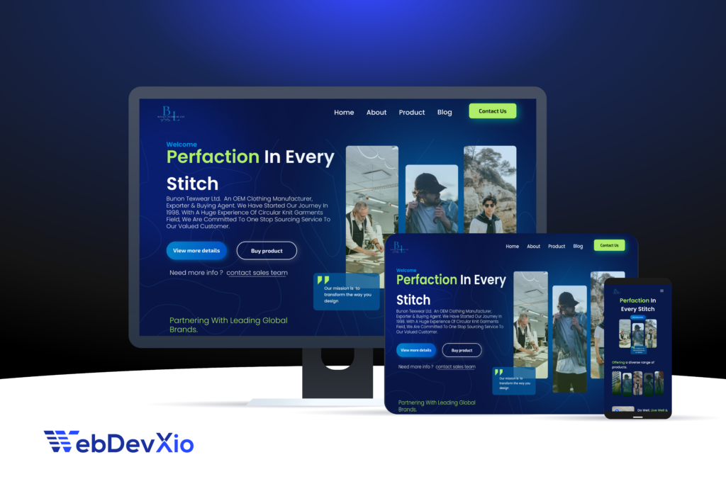
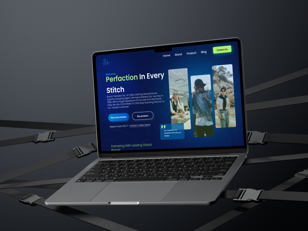
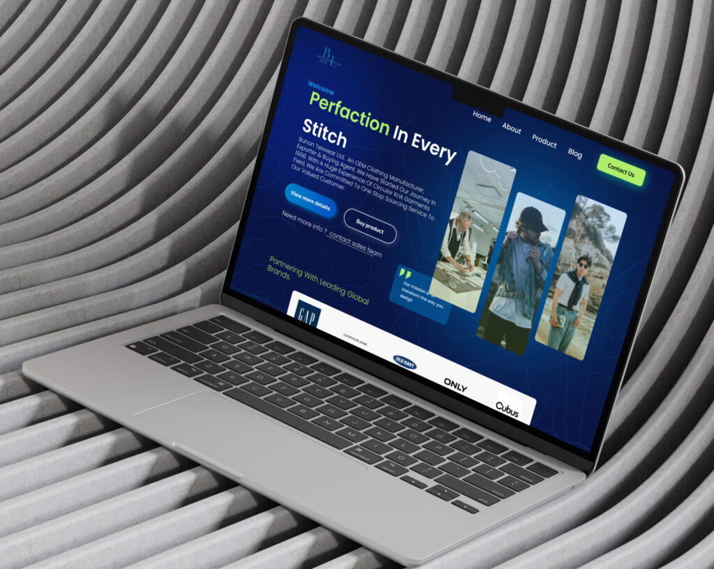
Case Study: Website Design for Bunon Texwear Ltd.
1. Title
Website Design for Bunon Texwear Ltd.: Showcasing Textile Excellence
2. Project Overview
This project involved designing a modern, professional website for Bunon Texwear Ltd., a textile manufacturer and exporter, to highlight their services, product range, and industry expertise while appealing to global buyers.
3. Problem Statement
The existing website was outdated and lacked trust-building elements. It failed to effectively present Bunon Texwear’s experience, products, and credibility, making it difficult to attract international buyers and partners.
4. Objective
The goal was to create a visually appealing, responsive, and user-friendly website to showcase the company’s expertise, product diversity, and trusted partnerships with global brands.
A programming language is for thinking about programs, not for expressing programs you’ve already thought of. It should be a pencil, not a pen.
There are many variations of passages of Lorem Ipsum available, but the majority have suffered alteration in some form, by injected humour, or randomised words which don’t look even slightly believable. If you are going to use a passage of Lorem Ipsum. You need to be sure there isn’t anything embarrassing hidden in the middle of text. All the Lorem Ipsum generators on the Internet tend toitrrepeat predefined chunks. Necessary, making this the first true generator on the Internet. It re are many variations of passages of Lorem Ipsum available, but the majority have suffered alteration in some form, by injectedeed eedhumour, or randomised words which don’t look even slightly believable.
There are many variations of passages of Lorem Ipsum available, but the majority have suffered alteration in some form, by injected humour, or randomised words which don’t look even slightly believable. If you are going to use a passage of Lorem Ipsum. You need to be sure there isn’t anything embarrassing hidden in the middle of text. All the Lorem Ipsum generators on the Internet tend toitrrepeat predefined chunks. Necessary, making this the first true generator on the Internet. It re are many variations of passages of Lorem Ipsum available, but the majority have suffered alteration in some form, by injectedeed eedhumour, or randomised words which don’t look even slightly believable.
Lorem ipsum dolor sit amet, consectetur adipiscing elit, sed do eiusmod tempor incididunt ut labore et dolore magna aliqua. Quis ipsum suspendisse ultrices gravida. Risus commodo .
There are many variations of passages of Lorem Ipsum available, but the majority have suffered alteration in some form, by injected humour, or randomised words which don’t look even slightly believable. If you are going to use a passage of Lorem Ipsum. You need to be sure there isn’t anything embarrassing hidden in the middle of text. All the Lorem Ipsum generators on the Internet tend toitrrepeat predefined chunks. Necessary, making this the first true generator on the Internet. It re are many variations of passages of Lorem Ipsum available, but the majority have suffered alteration in some form, by injectedeed eedhumour, or randomised words which don’t look even slightly believable.
Necessary, making this the first true generator on the Internet. It re are many variations of passages of Lo rem Ipsum available, but the majority have suffered alteration in some form, by injectedeed eedhumour, or randomised words which don’t look even slightly believable.
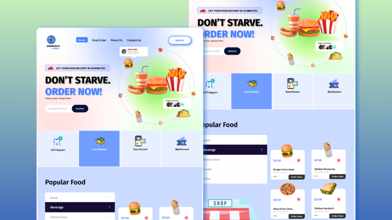
The Quickest Way to Deliver Your Message? Make It Visual.
There are many variations of passages of Lorem Ipsum available, but the majority have suffered alteration in some form, by injected humour, or randomised words which don’t look even slightly believable. If you are going to use a passage of Lorem Ipsum. You need to be sure there isn’t anything embarrassing hidden in the middle of text. All the Lorem Ipsum generators on the Internet tend toitrrepeat predefined chunks.

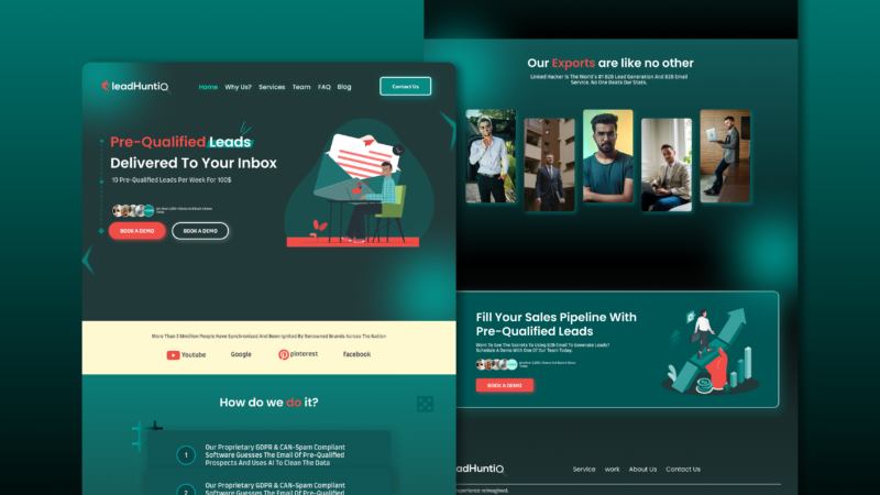
Redesign of Leadhunt.com Website for Better User Engagement.
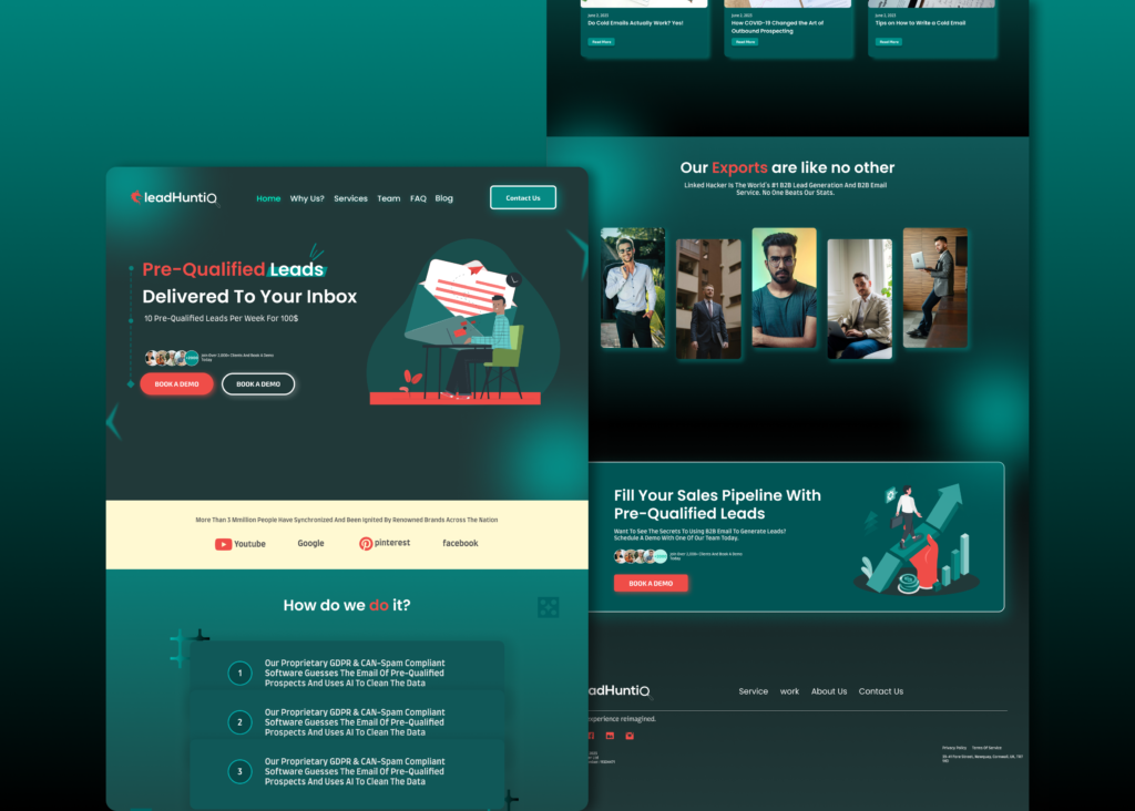
Leadhunt.io is a lead generation company. The project involved a comprehensive redesign of their website to improve user navigation, optimize lead generation workflows, and modernize the overall visual design.
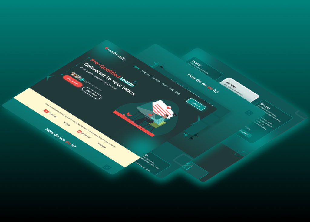


Case Study: Redesign of Leadhunt.io Website
1. Title
- Leadhunt.io Website Redesign: Enhancing User Experience and Lead Conversion
2. Project Overview
- Leadhunt.io is a lead generation company. The project involved a comprehensive redesign of their website to improve user navigation, optimize lead generation workflows, and modernize the overall visual design.
3. Problem Statement
- The website lacked an intuitive user interface, resulting in lower lead conversions and high bounce rates. Key issues included:
- Cluttered navigation.
- Outdated visual design.
- Inefficient lead capture forms.
4. Objective
The goal was to create a user-friendly, visually appealing website to drive lead conversions and establish a professional online presence.
Process/Approach
1. Research
- Goal: Understand the existing website’s pain points and opportunities for improvement.
- Conducted a heuristic evaluation to identify usability issues.
- Analyzed competitor websites to gather best practices and inspiration.
- Collaborated with the Leadhunt.io team to align on target audience needs and business goals.
2. User Personas
-
- Primary Persona: Small business owners seeking lead generation tools.
- Secondary Persona: Marketing professionals evaluating platforms for campaigns.
3. Wireframing
- Designed low-fidelity wireframes focusing on:
- Simplified navigation for easy exploration.
- Clear content hierarchy emphasizing lead generation.
- Key sections like “Services,” “Pricing,” and “Contact Us.”
4. UI Design
- Developed high-fidelity mockups using Figma, prioritizing:
- A modern and professional visual identity.
- Consistent use of colors, typography, and iconography.
- A clean layout to enhance readability and engagement.
5. Prototyping & Testing
- Created interactive prototypes for usability testing.
- Gathered feedback from selected users to identify improvements.
- Iterated the design based on insights to enhance user flows and CTAs.
6. Development Handoff
Provided responsive design assets to ensure compatibility across devices.
Delivered detailed design specifications and style guides for seamless implementation.
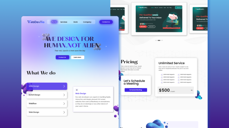
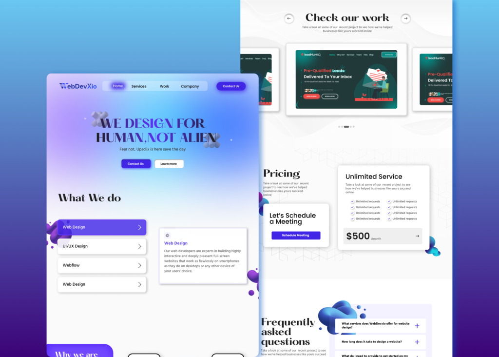
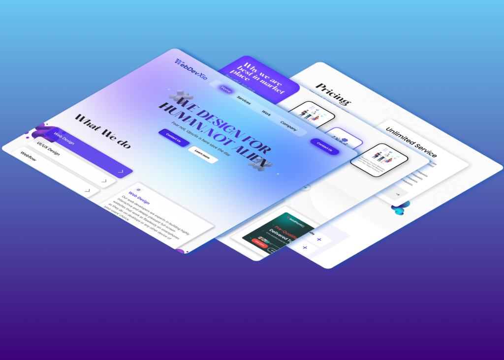
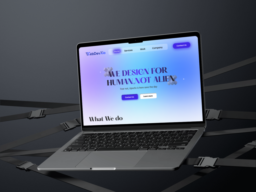
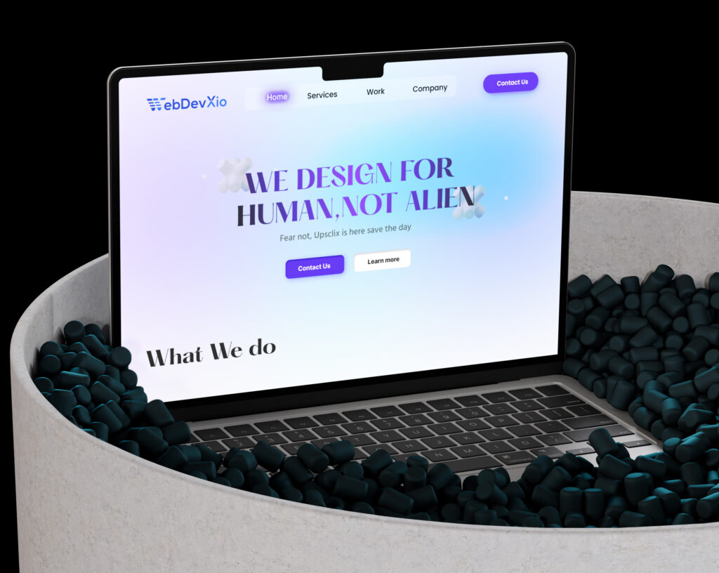
Redesign of webdevxio.com Website for Better User Engagement.
Case Study: Redesign of Leadhunt.io Website
1. Title
- Leadhunt.io Website Redesign: Enhancing User Experience and Lead Conversion
2. Project Overview
- Leadhunt.io is a lead generation company. The project involved a comprehensive redesign of their website to improve user navigation, optimize lead generation workflows, and modernize the overall visual design.
3. Problem Statement
- The website lacked an intuitive user interface, resulting in lower lead conversions and high bounce rates. Key issues included:
- Cluttered navigation.
- Outdated visual design.
- Inefficient lead capture forms.
4. Objective
The goal was to create a user-friendly, visually appealing website to drive lead conversions and establish a professional online presence.
Process/Approach
1. Research
- Goal: Understand the existing website’s pain points and opportunities for improvement.
- Conducted a heuristic evaluation to identify usability issues.
- Analyzed competitor websites to gather best practices and inspiration.
- Collaborated with the Leadhunt.io team to align on target audience needs and business goals.
2. User Personas
- Primary Persona: Small business owners seeking lead generation tools.
- Secondary Persona: Marketing professionals evaluating platforms for campaigns.
3. Wireframing
- Designed low-fidelity wireframes focusing on:
- Simplified navigation for easy exploration.
- Clear content hierarchy emphasizing lead generation.
- Key sections like “Services,” “Pricing,” and “Contact Us.”
4. UI Design
- Developed high-fidelity mockups using Figma, prioritizing:
- A modern and professional visual identity.
- Consistent use of colors, typography, and iconography.
- A clean layout to enhance readability and engagement.
5. Prototyping & Testing
- Created interactive prototypes for usability testing.
- Gathered feedback from selected users to identify improvements.
- Iterated the design based on insights to enhance user flows and CTAs.
6. Development Handoff
Provided responsive design assets to ensure compatibility across devices.
Delivered detailed design specifications and style guides for seamless implementation.
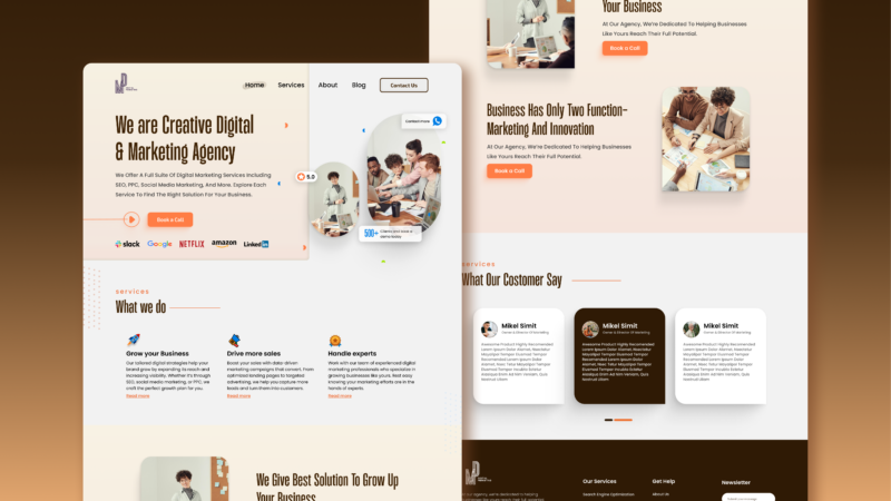
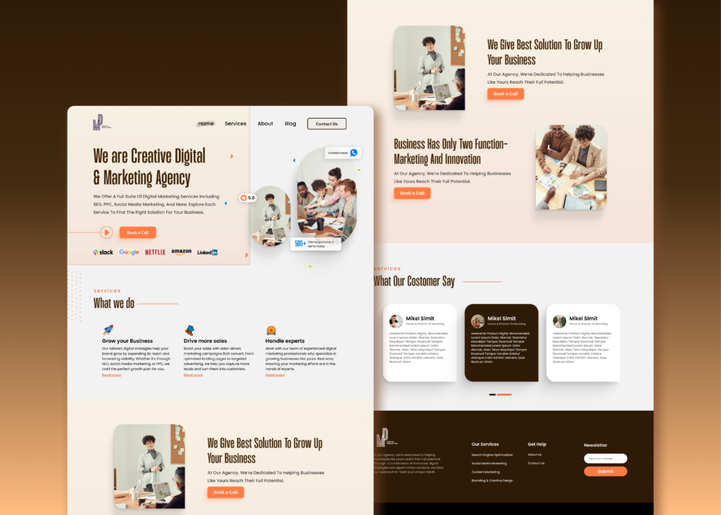
Modern Lead Generation Website for a Digital Marketing Agency.
There are many variations of passages of Lorem Ipsum available, but the majority have suffered alteration in some form, by injected humour, or randomised words which don’t look even slightly believable. If you are going to use a passage of Lorem Ipsum. You need to be sure there isn’t anything embarrassing hidden in the middle of text. All the Lorem Ipsum generators on the Internet tend toitrrepeat predefined chunks.
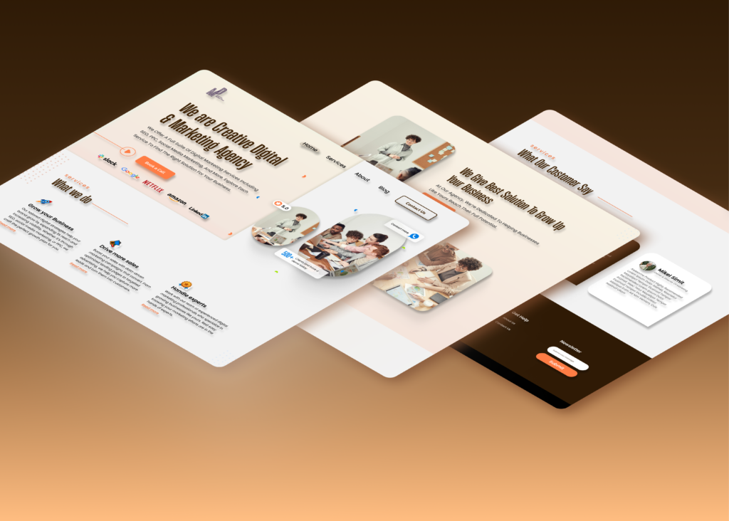
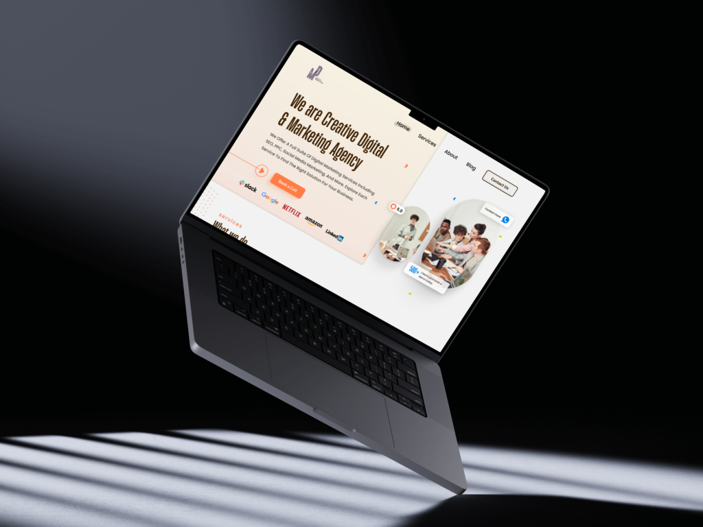
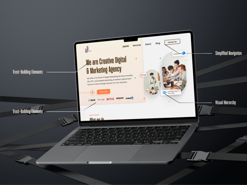

Case Study: Lead Generation Website Design
Title
- Modern Lead Generation Website for a Digital Marketing Agency
Project Overview
- This project aimed to design a professional, conversion-optimized website for a digital marketing agency. The website highlighted the agency’s expertise, built trust with potential clients, and drove lead submissions.
Problem Statement
- Agencies often struggle with retaining user attention and converting website visitors into leads. The existing design lacked clarity, a strong CTA focus, and modern aesthetics to engage users effectively.
4. Objective
To create a visually appealing, user-centric website that enhances trust, highlights key services, and optimizes lead generation workflows.
Process/Approach
1. Research
- Goal: Understand the needs of a lead generation-focused digital marketing agency and analyze design trends.
- Conducted competitor analysis of top digital marketing websites to identify best practices for engagement and conversions.
- Collaborated with stakeholders to define user personas, focusing on small business owners and marketing teams.
- Mapped user journeys to highlight the most critical conversion points.
2. User Personas
- Developed two key personas:
- Small Business Owner: Looking for digital marketing solutions to boost brand visibility.
- Marketing Professional: Searching for experienced agencies to handle ad campaigns effectively.
3. Wireframing
- Created low-fidelity wireframes with a focus on:
- A prominent hero section for showcasing the agency’s unique selling proposition and CTAs.
- Service sections broken into easy-to-digest highlights.
- Testimonials for trust-building.
- A simple, visually appealing footer with key contact details and a newsletter signup.
4. UI Design
- Designed high-fidelity mockups using Figma with:
- A warm, professional color palette to create a trustworthy yet creative feel.
- Clean typography to emphasize readability.
- Strategically placed CTAs like “Book a Call” to guide user actions.
- A visual balance of images, icons, and text to keep users engaged.
5. Prototyping & Testing
- Built interactive prototypes to validate usability and ensure:
- Navigation was smooth and intuitive.
- Lead capture forms were accessible and simple to complete.
- The design worked seamlessly across all screen sizes (responsive testing).
- Collected feedback from potential users to refine the layout and interaction design.
6. Development Handoff
Worked closely with developers to ensure design accuracy during implementation.
Delivered detailed design files, including style guides, icons, and responsive assets.
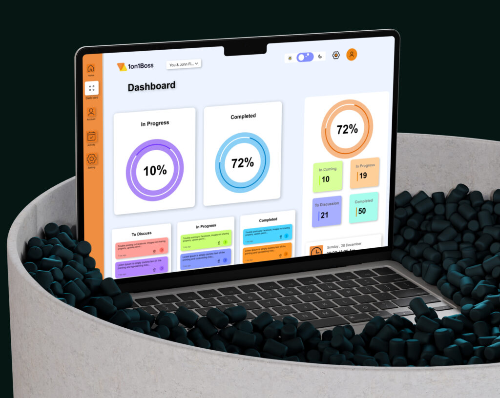
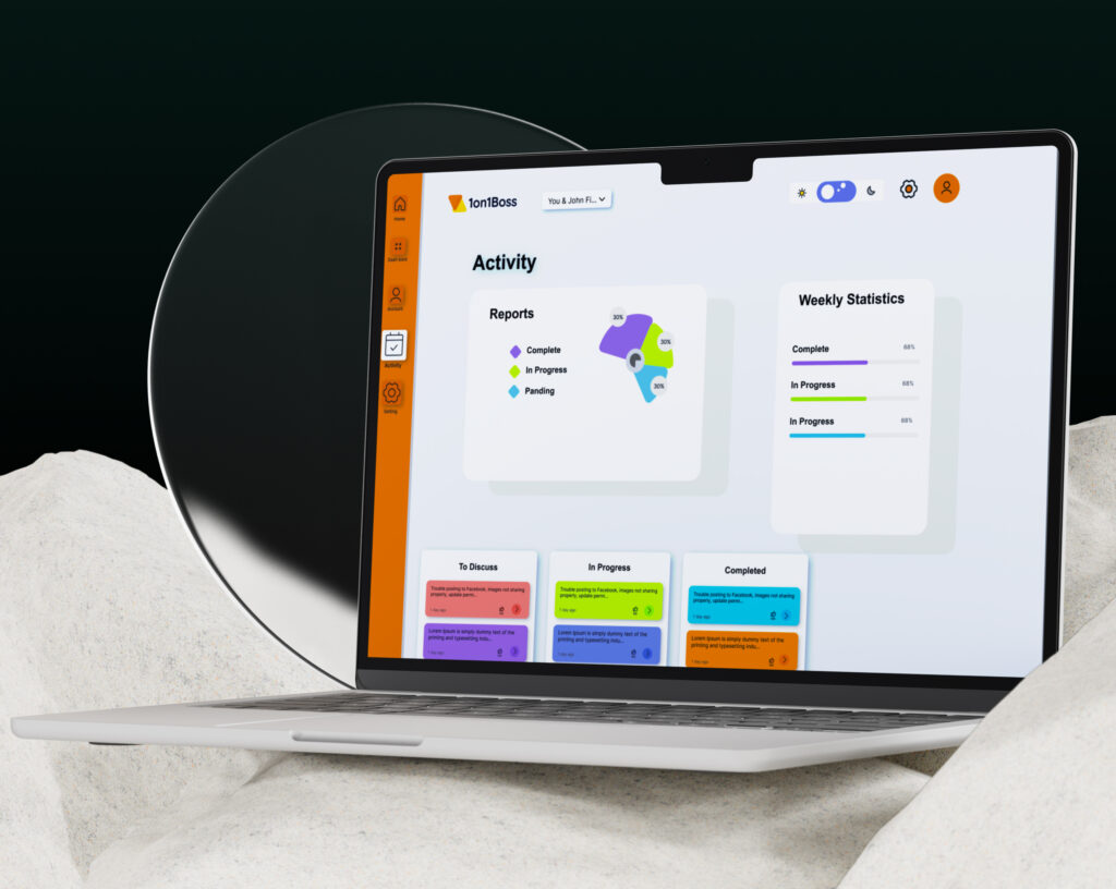
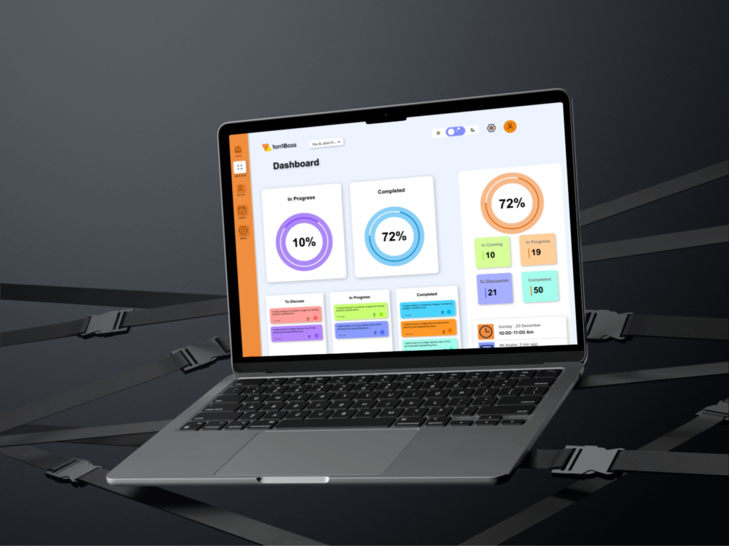
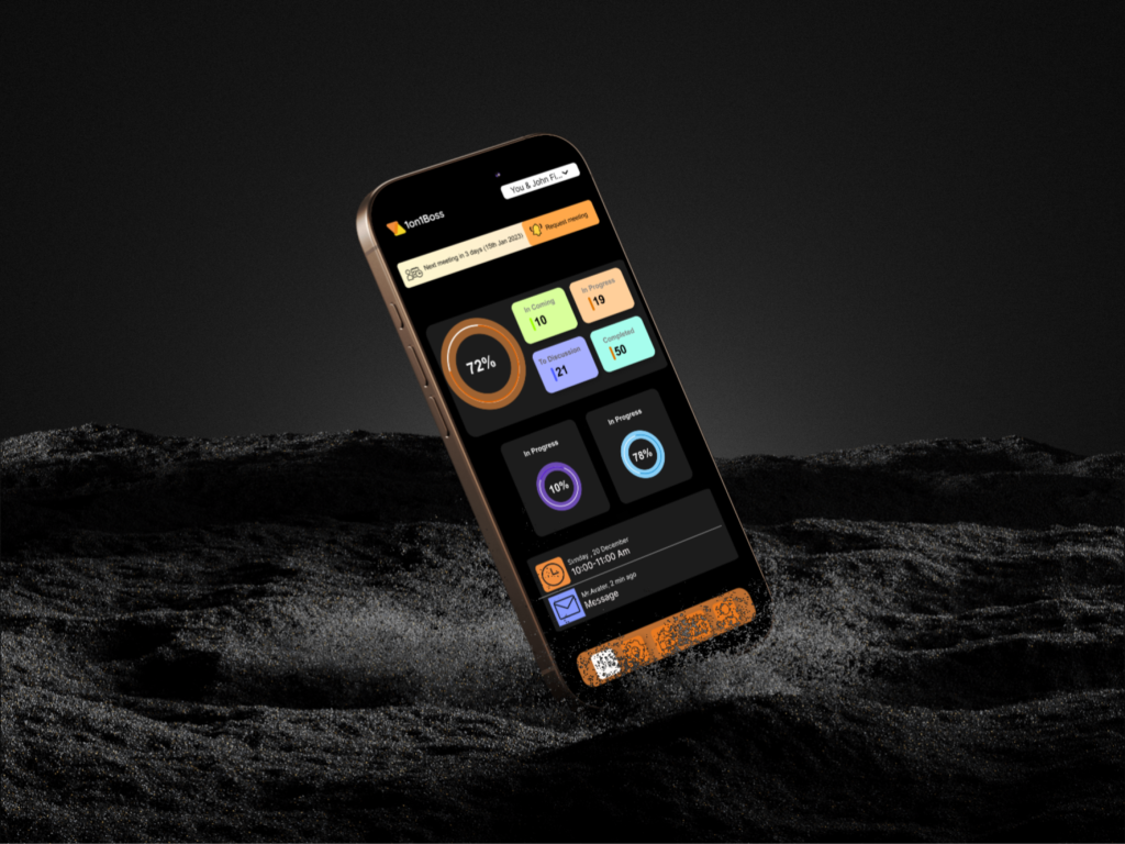
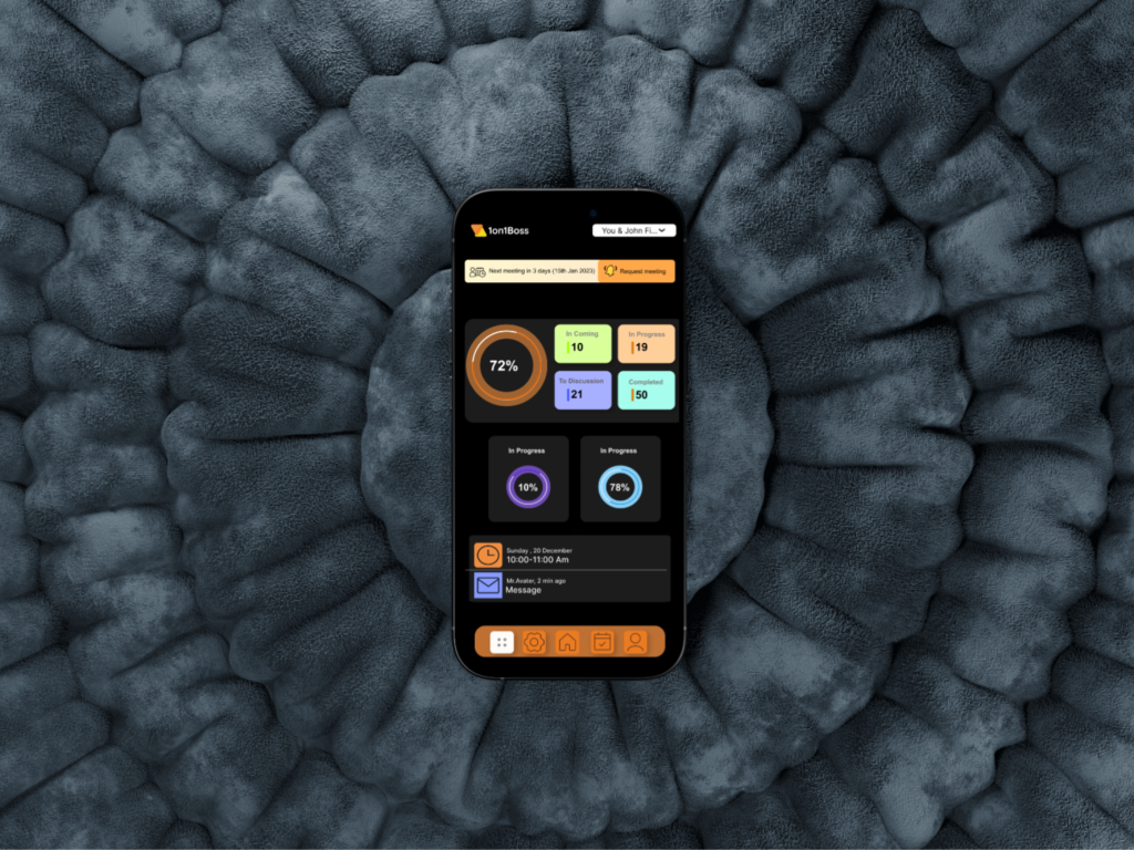
SAAS Application Redesign
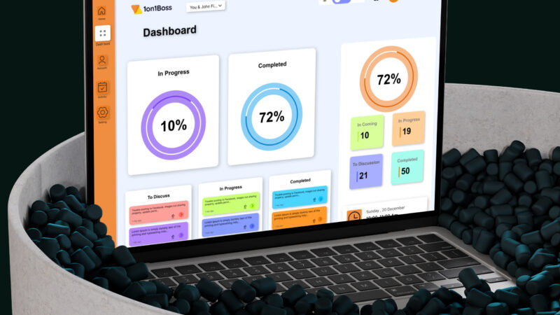
SAAS Application Redesign
1. Title
- Leadhunt.io Website Redesign: Enhancing User Experience and Lead Conversion
2. Project Overview
- Leadhunt.io is a lead generation company. The project involved a comprehensive redesign of their website to improve user navigation, optimize lead generation workflows, and modernize the overall visual design.
3. Problem Statement
- The website lacked an intuitive user interface, resulting in lower lead conversions and high bounce rates. Key issues included:
- Cluttered navigation.
- Outdated visual design.
- Inefficient lead capture forms.
4. Objective
The goal was to create a user-friendly, visually appealing website to drive lead conversions and establish a professional online presence.
Process/Approach
1. Research
- Goal: Understand the existing website’s pain points and opportunities for improvement.
- Conducted a heuristic evaluation to identify usability issues.
- Analyzed competitor websites to gather best practices and inspiration.
- Collaborated with the Leadhunt.io team to align on target audience needs and business goals.
2. User Personas
-
- Primary Persona: Small business owners seeking lead generation tools.
- Secondary Persona: Marketing professionals evaluating platforms for campaigns.
3. Wireframing
- Designed low-fidelity wireframes focusing on:
- Simplified navigation for easy exploration.
- Clear content hierarchy emphasizing lead generation.
- Key sections like “Services,” “Pricing,” and “Contact Us.”
4. UI Design
- Developed high-fidelity mockups using Figma, prioritizing:
- A modern and professional visual identity.
- Consistent use of colors, typography, and iconography.
- A clean layout to enhance readability and engagement.
5. Prototyping & Testing
- Created interactive prototypes for usability testing.
- Gathered feedback from selected users to identify improvements.
- Iterated the design based on insights to enhance user flows and CTAs.
6. Development Handoff
Provided responsive design assets to ensure compatibility across devices.
Delivered detailed design specifications and style guides for seamless implementation.
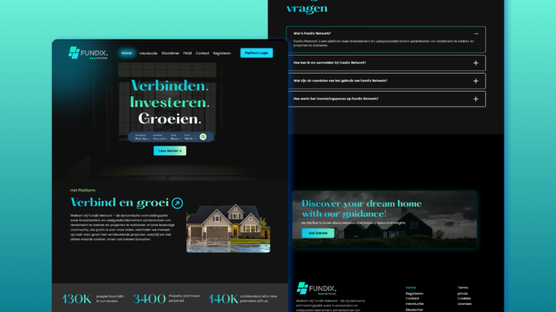
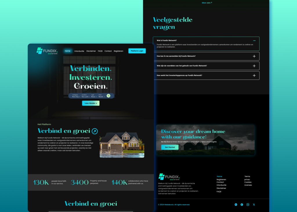
Fundix Network – Connecting Investors and Real Estate Entrepreneurs
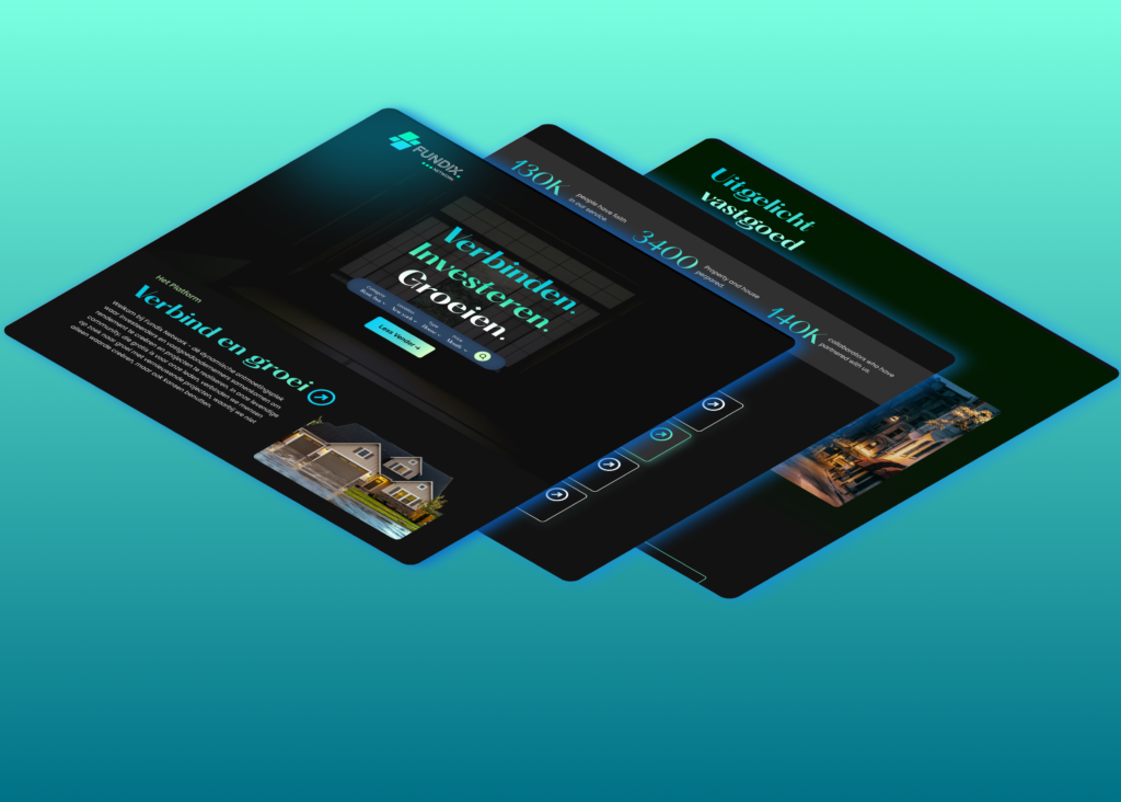
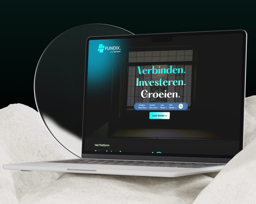
Fundix Network is an innovative platform designed to bridge the gap between investors and real estate entrepreneurs. The platform facilitates collaboration, helping users create value and achieve their investment goals through a seamless digital experience.
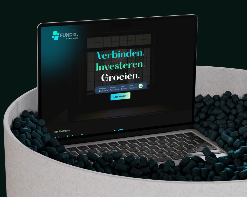
Objective
To redesign the Fundix Network website, focusing on:
- Enhancing user trust and engagement.
- Simplifying navigation and usability.
- Creating a visually appealing interface to represent the platform’s professionalism and purpose.
Problem Statement
The previous Fundix Network website struggled to:
- Communicate its value proposition effectively.
- Provide a smooth and intuitive user experience.
- Build user trust through a modern and professional design.
The redesign aimed to address these challenges while aligning the website with the brand’s mission of connecting, investing, and growing.
Design Approach
User Interface (UI):
- A vibrant, professional color palette of teal and black to evoke trust and innovation.
- High-quality real estate imagery to resonate with the target audience.
- Modern typography for enhanced readability and sophistication.
User Experience (UX):
- Logical grouping of information to reduce cognitive load.
- A sticky navigation bar for consistent and effortless exploration of the website.
- Responsive design for seamless usability across devices.
Prototyping Tools:
- Designed in Figma for rapid prototyping and collaboration.
Implementation
- Research & Analysis:
- Analyzed user behavior and feedback to identify pain points.
- Studied competitors to benchmark best practices.
- Wireframes & Mockups:
- Created wireframes to outline layout and functionality.
- Designed high-fidelity mockups in Figma to visualize the final product.
- Development:
- Collaborated with developers to ensure a pixel-perfect implementation.
- Conducted usability testing to validate design decisions.
The redesign of Fundix Network demonstrates the power of user-centric design in fostering trust, engagement, and growth. By focusing on functionality and aesthetics, the platform now delivers a seamless experience that connects investors and real estate entrepreneurs effectively.
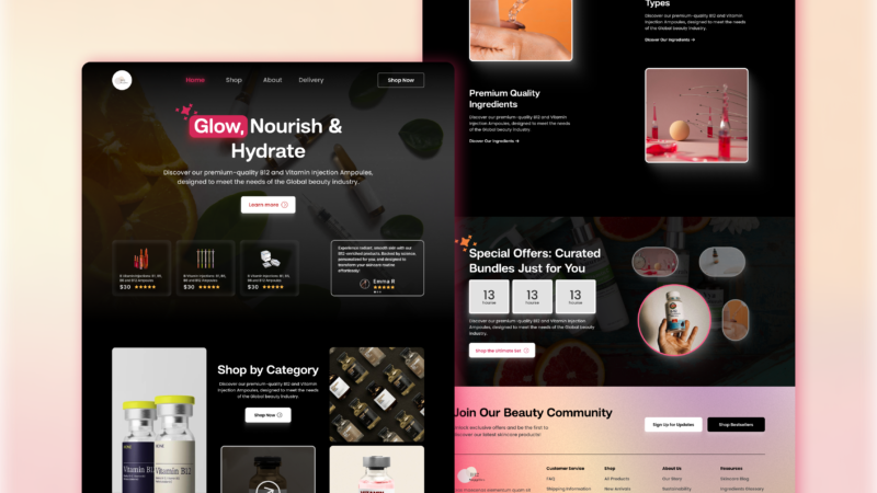
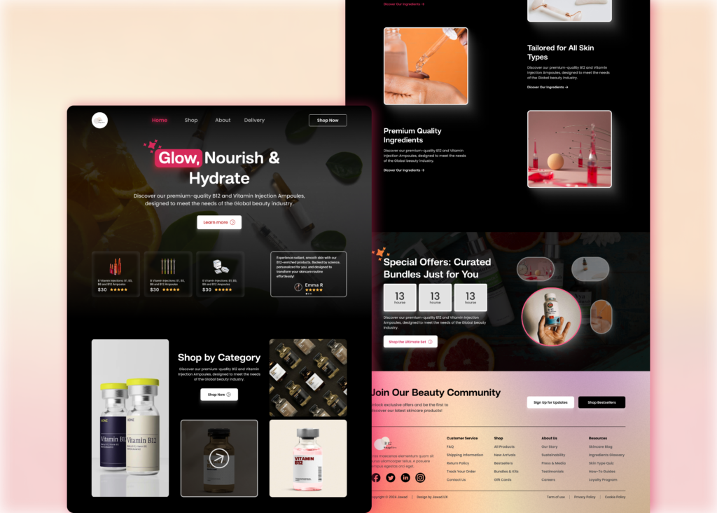
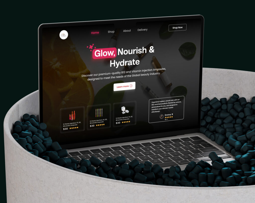
B12Supplies: Transforming Online Shopping with a Fresh Design
1. Title
- B12Supplies – Redesigning an E-Commerce Website.
2. Project Overview
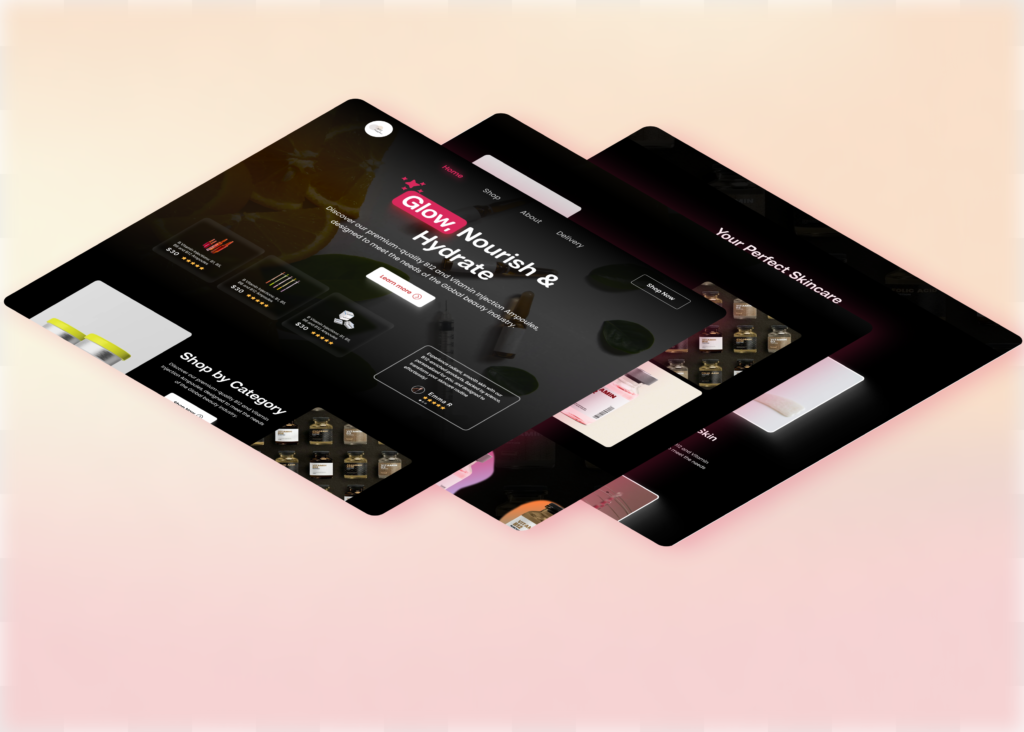
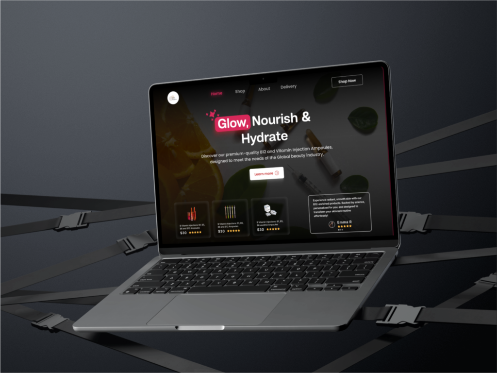
- B12Supplies.com is an e-commerce platform specializing in premium-quality B12 and Vitamin injection ampoules. The website redesign focused on creating an engaging, user-friendly experience to boost conversions and align with modern design trends.
3. Problem Statement
- The website lacked an intuitive user interface, resulting in lower lead conversions and high bounce rates. Key issues included:
- Delivering a modern, aesthetically pleasing interface.
- Communicating product value and unique selling points effectively.
- Offering intuitive navigation for users to find products quickly. Inefficient lead capture forms.
4. Objective
The goal was to create a user-friendly, visually appealing website to drive lead conversions and establish a professional online presence.
- Visual appeal to attract a health-conscious audience.
- Simplified navigation for effortless shopping.
- Increased brand credibility through clean, professional design.
Process/Approach
Design Approach:
Designed in Figma to enable rapid feedback and iterations.
User Interface (UI):
A dark theme combined with vibrant gradients for a luxurious feel.
Consistent use of rounded edges and soft shadows to convey warmth and professionalism.
Typography that balances elegance and readability.
User Experience (UX):
Prioritized accessibility with clear hierarchies and intuitive navigation.
Streamlined checkout process to reduce drop-offs.
Responsive design to ensure a seamless experience across desktop and mobile.
Implementation:
The redesign process involved:
Collaborating with developers for precise implementation.
Analyzing user behavior through heatmaps and analytics.
Crafting wireframes and mockups to explore layout options.
Testing designs with a sample audience to ensure usability.
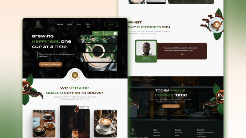
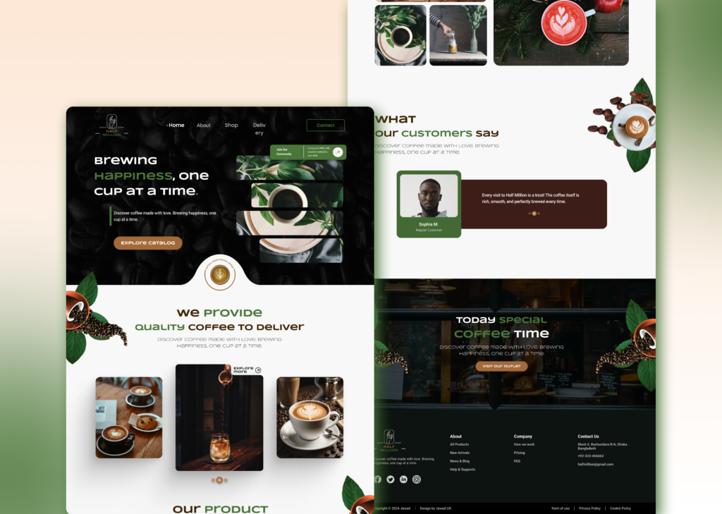
Coffee shop Landing Page
